Creating a centered equilateral triangle using CSS and a single element
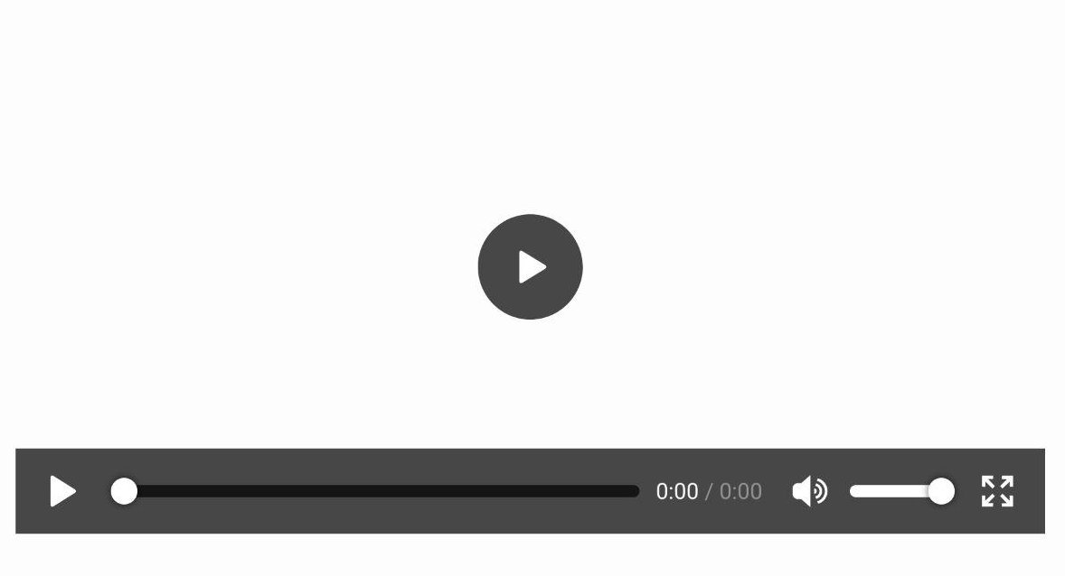
#CodingThis post explains in detail how to enhance a single HTML element with a centered equilateral triangle using only CSS. The objective is to recreate the play button of the HTML Video element from Firefox for Android as seen below.
This is just a screenshot, not a video ;)
Creating triangles using CSS borders
Lets shortly recapitulate how CSS borders work exactly. Starting with a single div with borders on three sides and take a look how those three borders meet each other.
.border-demo-01 {
  --border-width: 5em;
  border-bottom: var(--border-width) solid #64ffcb;
  border-left: var(--border-width) solid #ffa764;
  border-right: var(--border-width) solid #ff64a7;
  border-top: 0;
  height: 5em;
  width: 10em;
}
The border at the bottom is a isosceles trapezoid with both base angles 45°. Assuming the div would shrink to a width of zero, this border would become a triangle.
.border-demo-02 {
  --border-width: 5em;
  border-bottom: var(--border-width) solid #64ffcb;
  border-left: var(--border-width) solid #ffa764;
  border-right: var(--border-width) solid #ff64a7;
  border-top: 0;
  height: 5em;
  width: 0;
}

.border-demo-03 {
  --border-width: 5em;
  border-bottom: var(--border-width) solid #64ffcb;
  border-left: var(--border-width) solid transparent;
  border-right: var(--border-width) solid transparent;
  border-top: 0;
  height: 0;
  width: 0;
}
Great! Now the border at the bottom is a right triangle. But the objective is to create an equilateral triangle.
Manipulate the angles of a CSS border triangle
A triangle is equilateral when all three internal angles are 60°. The internal angles of the CSS triangle can be manipulated by changing the width of the left and right border. But how is the border width for an equilateral triangle which the length of each side denoted as a calculated?

Since border-left and border-right are equal, they are both akin a/2. border-bottom can be calculated from a using the Pythagorean theorem with:
Using this formula an equilateral triangle can be rendered with the following CSS:
.border-demo-04 {
  --a: 10em;
  border-bottom: calc(0.866 * var(--a)) solid #64ffcb;
  border-left: calc(var(--a) / 2) solid transparent;
  border-right: calc(var(--a) / 2) solid transparent;
  border-top: 0;
  height: 0;
  width: 0;
}
Center the triangle in its containing element
What is the center of a triangle? There is a huge variety of triangle centers. For example the incenter, which is the intersection of all angle bisectors, the centroid, which is the intersection of all medians and also represents the center of mass or the orthocenter, which is the intersection of each sides altitude.
Fortunately these points are all the same for an equilateral triangle. But why is the center even important? What is the center of the triangle if it is rendered as it is?
As you can see, its current “center” is just the center of the smallest rectangle, that can be rendered around the triangle.

The final bit of information needed to center the triangle is the distance from the current center C to the incenter I of the triangle. Both points are located on the altitude of the triangles base line. The altitude from the base line to I - denoted as hc here - is calculated using the tangent in the triangle between the baseline, the angle bisector of the triangles bottom left corner and the altitude on the triangles baseline.
Finally the offset from the current center C to the incenter I can be calculated with border-bottom/2 - hc. After translating the triangle on the Y-axis by the offset from C to I, the incenter of the rectangle is the same point as the center of its containing element.
.border-demo-05 {
  --a: 10em;
  --border-bottom: calc(0.866 * var(--a));
  border-bottom: var(--border-bottom) solid #64ffcb;
  border-left: calc(var(--a) / 2) solid transparent;
  border-right: calc(var(--a) / 2) solid transparent;
  border-top: 0;
  height: 0;
  transform: translateY(calc(-1 * 0.2887 * var(--border-bottom) * 0.5));
  width: 0;
}
Apply all together to an single element.
Now everything can be put together. The objecte is still to recreate the play button from the Firefox for Android media player. Furthermore only a single HTML element should be used.
First this single HTML element is display as a circle with a border-radius
of 50%.
Then all it’s content is centerent using display: flex;, align-items: center
and justify-content: center;.
Last but not least the triangle is then created with the
::after pseudo-element.
.border-demo-06 {
  align-items: center;
  background-color: rgba(20, 20, 20, 0.8);
  border-radius: 50%;
  display: flex;
  height: 20em;
  justify-content: center;
  width: 20em;
}

.border-demo-06::after {
  --a: 10em;
  --border-left: calc(0.866 * var(--a));
  border-bottom: calc(var(--a) / 2) solid transparent;
  border-left: var(--border-left) solid white;
  border-right: 0;
  border-top: calc(var(--a) / 2) solid transparent;
  content: "";
  height: 0;
  transform: translateX(calc(0.2887 * var(--border-left) * 0.5));
  width: 0;
}